Looking for Summer Shade
This blog post walks through how to deal with Bigquery GIS data by looking for regions in New York City with the most shade.
- Part I: Getting the data in bigquery
- Part 3: Computing the shadiness per zip code
- Part 4: Vizualization
- Some Observations
- Conclusion
- Next Steps
Bigquery has a lot of public datasets available. Not only is there a vast number of datasets available, but cross referencing them and accessing them is free (up until a limit)!
The purpose of this blog post is show how easy this is. In this blog post, I will walk you through the New York tree dataset and the US Census zip code geometry dataset to show you how to compute how likely a region is to have shade, making it a nicer candidate for a stroll on a hot summer day.
Getting the data is fairly easy. Google has documentation here. It is assumed that you have already created a google cloud account. But if you did not, I hope this motivates you to give it a try!
The datasets
For this demo, I will be looking at two datasets:
New York street trees
We will be looking at data gathered from the 2015 tree census. You may find it here
US Census Boundaries
When looking at the data, we will segment it by some sort of boundary for easier visualization. We could use tiling approaches, but it will be fun to use existing data. Let's try the zip code tabulation areas. You may find the us census boundaries dataset here
Bigquery: The pandas API
These datasets are actually pretty small to download and work with offline. But since this data is offered publicly in bigquery, and bigquery offers up to 2TB of queries free per month (here we'll be running about 12 GB of queries), it is well worth leveraging. On top of this, some of the queries we need to make will involve geospatial joins. It will be much easier to let bigquery handle this.
The queries that will be presented could just be run in the UI here. However, for convenience, they will be run in a jupyter notebook.
import geojson
# For plotting
import plotly.express as px
# For filtering some of the tabular data we will generate
import pandas as pd
# For converting shapes
import shapely
# For converting shape information output as text from bigquery
import shapely.wkt

# Used to send bigquery queries.
%load_ext google.cloud.bigquery
%%bigquery df_zip_codes --use_bqstorage_api

WITH
zip_codes AS (
    SELECT
        # The zip code
        zip_code,
        # The place name (mainly useful for plotting)
        city,
        # The boundary of the zip code (for plotting)
        zip_code_geom ,
        # Some internal point in the zip code
        internal_point_geom,
        # We compute the surface aread of a zip code. We will need this later.
        ST_AREA(zip_code_geom) * 1e-6 AS surface_area_km2
    FROM `bigquery-public-data.geo_us_boundaries.zip_codes`
    # We filter only for new york zip codes
    WHERE state_code = 'NY'
),
# The last two temporary tables are used to further filter down our zip
# codes. These last two are not necessary and can be ignore as we will be
# filtering the data at a further step. However, it helps to perform filtering
# like this earlier on if possible when we're certain that we won't need the data.
new_york_area AS (
    SELECT * FROM `bigquery-public-data.geo_us_boundaries.urban_areas`
    WHERE REGEXP_CONTAINS(LOWER(name), '.*new york.*')
),
new_york_zip_codes AS (
    SELECT
        zip_code,
        city,
        zip_code_geom,
        surface_area_km2
    FROM zip_codes AS z
    JOIN new_york_area AS n
    ON ST_CONTAINS(n.urban_area_geom, z.internal_point_geom)
)


# I like to keep my final query simple. Sometimes
# queries can grow, and factoring queries into temporary
# tables helps better manage them.
SELECT * FROM new_york_zip_codes
We now have all new york zip codes.
df_zip_codes
Aside: Vizualizing using GeoViz
Note that when exploring this data, you can leverage a free visualization tool
in bigquery called geoviz. For example, you can run this query to select all new
york zip codes:
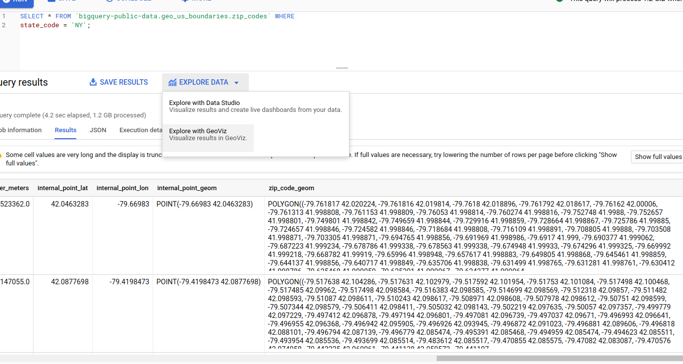
and click "Explore with GeoViz" to explore it:
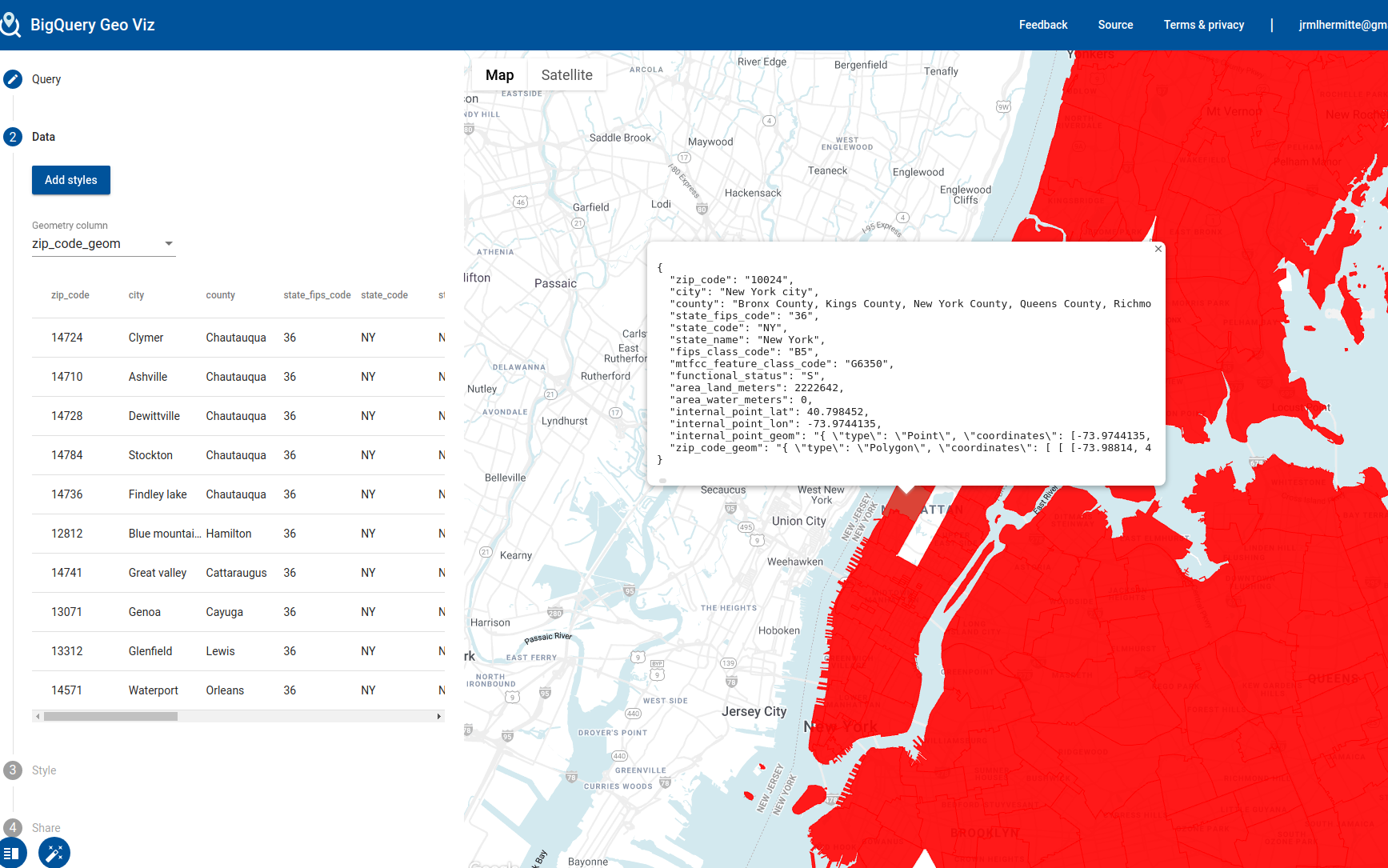
The purpose of this blog is not to go through these details but I thought I would highlight this useful feature.
The bigquery query for trees
We will not query the new york trees census.
Since our goal is to understand how each zip code is doing, we will also join it will information from the same zip codes table we used previously.
I will present the query involved here and explain it afterwards. Don't worry if some pieces don't seem to make sense yet.
%%bigquery df_trees --use_bqstorage_api

# This is the tree table. We generate it from the 2015 tree
# census and join it with the tree species table to join additional
# inforamtio
WITH trees AS (
SELECT
    ts.species_common_name,
    ST_GEOGPOINT(tc.longitude, tc.latitude) as center,
    FROM `bigquery-public-data.new_york_trees.tree_census_2015` as tc
    LEFT JOIN `bigquery-public-data`.new_york.tree_species as ts
    ON LOWER(tc.spc_common) = LOWER(ts.species_common_name)
    WHERE tc.status = 'Alive'
    AND STARTS_WITH(ts.tree_size, 'Large')
),
# For zip codes, we only need the zip code and boundaries
zip_codes AS (
    SELECT zip_code, zip_code_geom
    FROM `bigquery-public-data.geo_us_boundaries.zip_codes`
)

# We perform a spatial join.
# For every tree that is in a zip code, we will create one row
# with the zip code and tree information.
SELECT z.zip_code, t.* FROM trees AS t
JOIN zip_codes AS z
ON ST_CONTAINS(z.zip_code_geom, t.center)
What just happened here?
There are a few things going on in this query which I have not explained. I will now explain them in detail.
We know we want the geographical distribution of trees, so we have to include this in our query to start:
SELECT
    ST_GEOGPOINT(tc.longitude, tc.latitude) as center,
    FROM `bigquery-public-data.new_york_trees.tree_census_2015` as tc
    WHERE tc.status = 'Alive'
Here, status is an indicator of the tree health and center is it's location
as a GEOGRAPHY data type (this is the general umbrella data type for any
geospatial related data. See here for documentation).
Because this dataset includes dead trees, and we only care about shade, we use the status
field to filter down this dataset to live trees.
Since we want to know how much shade a region will be, we need to know a bit more
about the trees. The tree census table does not contain much information about
the trees themselves. However, there is another table, tree_species which does.
We can use the tree_size property to tell us how big a tree is. If you explore
the possible values, you will see that the posible values are:
%%bigquery df_tree_sizes --use_bqstorage_api

SELECT tree_size, COUNT(*) AS count
FROM `bigquery-public-data`.new_york.tree_species
GROUP BY tree_size
df_tree_sizes
We have 23 tree species that are Large, 11 Medium, 5 intermediate and 18 that are small. Since we really care about shade, and generally the largest trees provide the most shade, let's filter this data set down to the large trees. We can filter these rows out by just choosing the trees whose size attribute starts with 'Large'.
Putting it all together
We have in one table, a list of trees with their locations and in another table, a list of tree species we care about. We can join these two together by the species name. It turns out that in one table, the name has case whereas the other does not, so we'll have to process the species name a bit:
SELECT *
    FROM `bigquery-public-data.new_york_trees.tree_census_2015` as tc
    LEFT JOIN `bigquery-public-data`.new_york.tree_species as ts
    ON LOWER(tc.spc_common) = LOWER(ts.species_common_name)
The FROM line contains the tree census table (which we alias to tc).
The LEFT JOIN line contains the tree species table that we want to join
on (aliased to ts) and the ON line contains the condition we want
to join on: LOWER(tc.spc_common) = LOWER(ts.species_common_name).
The final query ends up being:
SELECT
    ts.species_common_name,
    ST_GEOGPOINT(tc.longitude, tc.latitude) as center,
    FROM `bigquery-public-data.new_york_trees.tree_census_2015` as tc
    LEFT JOIN `bigquery-public-data`.new_york.tree_species as ts
    ON LOWER(tc.spc_common) = LOWER(ts.species_common_name)
    WHERE tc.status = 'Alive'
    AND STARTS_WITH(ts.tree_size, 'Large')
)
Finally, we join this data with zip code data so that we can tag a zip code to the trees, again through a geospatial join:
SELECT z.zip_code, t.* FROM trees AS t
    JOIN zip_codes AS z
    ON ST_CONTAINS(z.zip_code_geom, t.center)
and we're done!
How many trees do we end up with? We get 275822. New York has quite a few trees:
df_trees
Part 3: Computing the shadiness per zip code
Finally, we are interested in the shadiness of a zip code. How will we determine this?
We can calculate it by just taking the number of trees in a given zip code and divide it by the surface area of the zip code. We'll do this bit in python, although it would certainly have been just as easy to run it in bigquery:
# where the 'count' colum is 1 for all rows
df_t = df_trees[['zip_code']].assign(count = 1)
# We now sum count for each zip code. This gives us the number
# of trees per zip code.
df_per_zip = df_t.groupby('zip_code').sum().reset_index(drop=False)
# Finally, we need the surface area. We get it by joining the
# zip codes table we created earlier:
df_per_zip = pd.merge(
    df_per_zip,
    df_zip_codes[['zip_code', 'surface_area_km2']],
    on='zip_code',
    how='left'
)
# And finally, we compute the count per km^2
df_per_zip['count_per_km2'] = df_per_zip['count'] / df_per_zip['surface_area_km2']
Part 4: Vizualization
We now want to visualize this data somehow. We're going to make a choropleth plot using plotly. If you haven't heard of it, plotly is an amazing interactive visualization library using javascript. It is extremely easy to use and generates professional looking interative graphs that can be used to give a little more life to your presentations.
Exploring the zip code shapes
First, let's explore the zip code shapes. Our zip codes table actually contains the bounding boxes of our zip codes in well known text (WKT) format.
# Let's graph one row
row = df_zip_codes.iloc[0]
geom_wkt = row['zip_code_geom']
geom_shapely = shapely.wkt.loads(geom_wkt)
# just print the geometry
geom_shapely
Wow, by simply typing the shapely object we were able to visualize it. How was this done? It's actually quite simple. The object is converted to SVG. You may read about it here.
This mostly comes from the fact that jupyter notebooks are run in a browser (and this blog is generated from a jupyter notebook). This avoids the need for libraries like matplotlib (see here for possible reasons not to use it).
Converting from a shapely geometry to geojson
The next bit is a bit out of scope of the goal of this blog post, so I will gloss over it quickly.
We will be plotting the counts per surface area for each zip code.
We will first convert each row in the zip codes table to a shapely geometry:
zip_code = row['zip_code']
place_name = row['city']
geom_wkt = row['zip_code_geom']
geom_shapely = shapely.wkt.loads(geom_wkt)
and from this, generate a GeoJSON Feature object:
polygon = shapely.geometry.mapping(
    geom_shapely
)
properties = {
    'zip_code': zip_code,
    'place_name': place_name
}
feature = dict(geojson.feature.Feature(
    geometry=polygon,
    properties=properties,
    id=self.zip_code,
))
However, in order to keep things robust, I will wrap this in a class. The idea here is that we're encoding some kind of information used to render GeoJSON data. When faced with these kind of conversions challenges, it is usually good practice to create an "adapter" class that every external type converts to. This is especially useful in geospatial data where often one might need to convert from WKT to something else etc.
Here is our wrapper class:
from __future__ import annotations
from typing import Dict, List


from geojson.feature import FeatureCollection
import dataclasses
from shapely.geometry import Polygon, MultiPolygon
import geojson


@dataclasses.dataclass
class ZipCodeGeometry:
    zip_code: str
    place_name: str
    boundary: Polygon

    @staticmethod
    def dataframe_to_feature_collection(df) -> geojson.feature.FeatureCollection:
        zip_code_geoms = ZipCodeGeometry.from_dataframe(df)
        features = [zip_code_geom.to_geojson_feature()
                    for zip_code_geom in zip_code_geoms]
        return dict(FeatureCollection(features=features))

    @staticmethod
    def from_dataframe(df) -> List[ZipCodeGeometry]:
        zip_code_geoms = []
        for _, row in df.iterrows():
            zip_code_geoms.append(ZipCodeGeometry.from_row(row))
        return zip_code_geoms

    @staticmethod
    def from_row(row: Dict) -> ZipCodeGeometry:
        geometries = []
        zip_code = row['zip_code']
        place_name = row['city']
        geom_wkt = row['zip_code_geom']
        geom_shapely = shapely.wkt.loads(geom_wkt)

        geometry = ZipCodeGeometry(
                zip_code=zip_code,
                place_name=place_name,
                boundary=geom_shapely,
            )
        return geometry

    def to_geojson_feature(self) -> geojson.feature.Feature:
        polygon = shapely.geometry.mapping(
            self.boundary
        )
        properties = {
            'zip_code': self.zip_code,
            'place_name': self.place_name
                     }
        feature = dict(geojson.feature.Feature(
            geometry=polygon,
            properties=properties,
            id=self.zip_code,
        ))
        feature['geometry'] = dict(feature['geometry'])
        return feature
And the conversion:
zip_code_geojson = ZipCodeGeometry.dataframe_to_feature_collection(df_zip_codes)
We now have everything we need to plot!
Plotting with plotly is easy:
fig = px.choropleth_mapbox(
    df_trees,
    geojson=zip_code_geojson,
    locations='zip_code',
    color_continuous_scale='Viridis',
    range_color=(0, 1300),
    zoom=9,
    center={"lat": 40.78307, "lon": -73.95423},
    labels={'count':'count'}
    )
fig.update_layout(margin={"r":0,"t":0,"l":0,"b":0})
fig.show()
Since the plot ends up being quite large to render, I have converted it to a jpg image below (and commented out the lines).
Note that had I wanted to display the full interactive plot, I could have used this:
from IPython.display import HTML
    HTML(fig.to_html())
However, the geojson data involved for the plot ends up taking up a lot of space (>40MB), and so to avoid this space usage I just output it as an image:
# file.write(fig.to_image(format='jpg', scale=4))
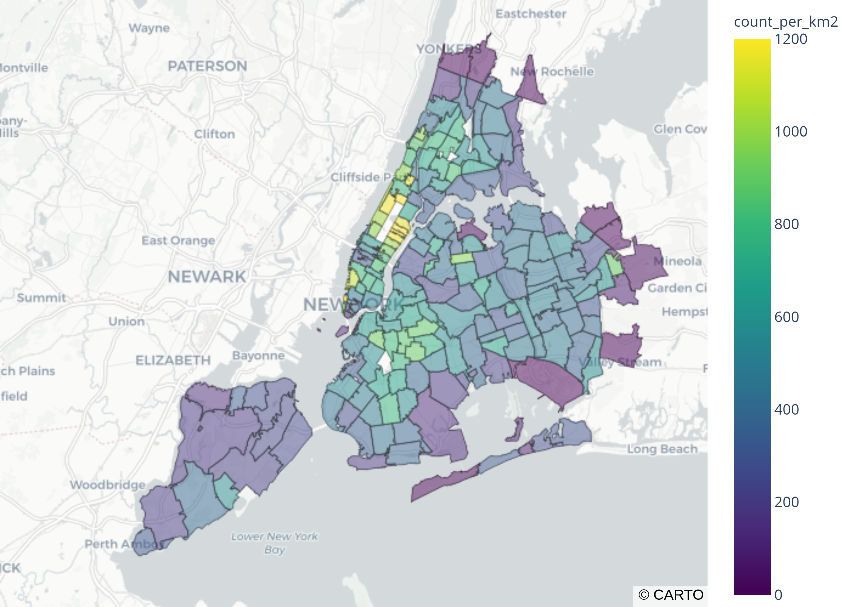
Some Observations
It looks like the regions that are the shadiest are closest to Central Park (upper left region with the yellow zip code boxes).
Why are there missing regions?
You'll also notice that some areas appear to be missing.
At first, I thought it was an artifact of plotting.
For example, you can see that central park does not appear to belong to any zip code.
You can check this specific zip code in the census bureau page here.
where you'll see something like this:
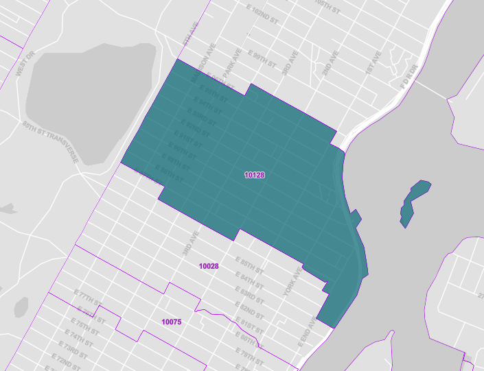
Note that this differs from what would see in google maps:
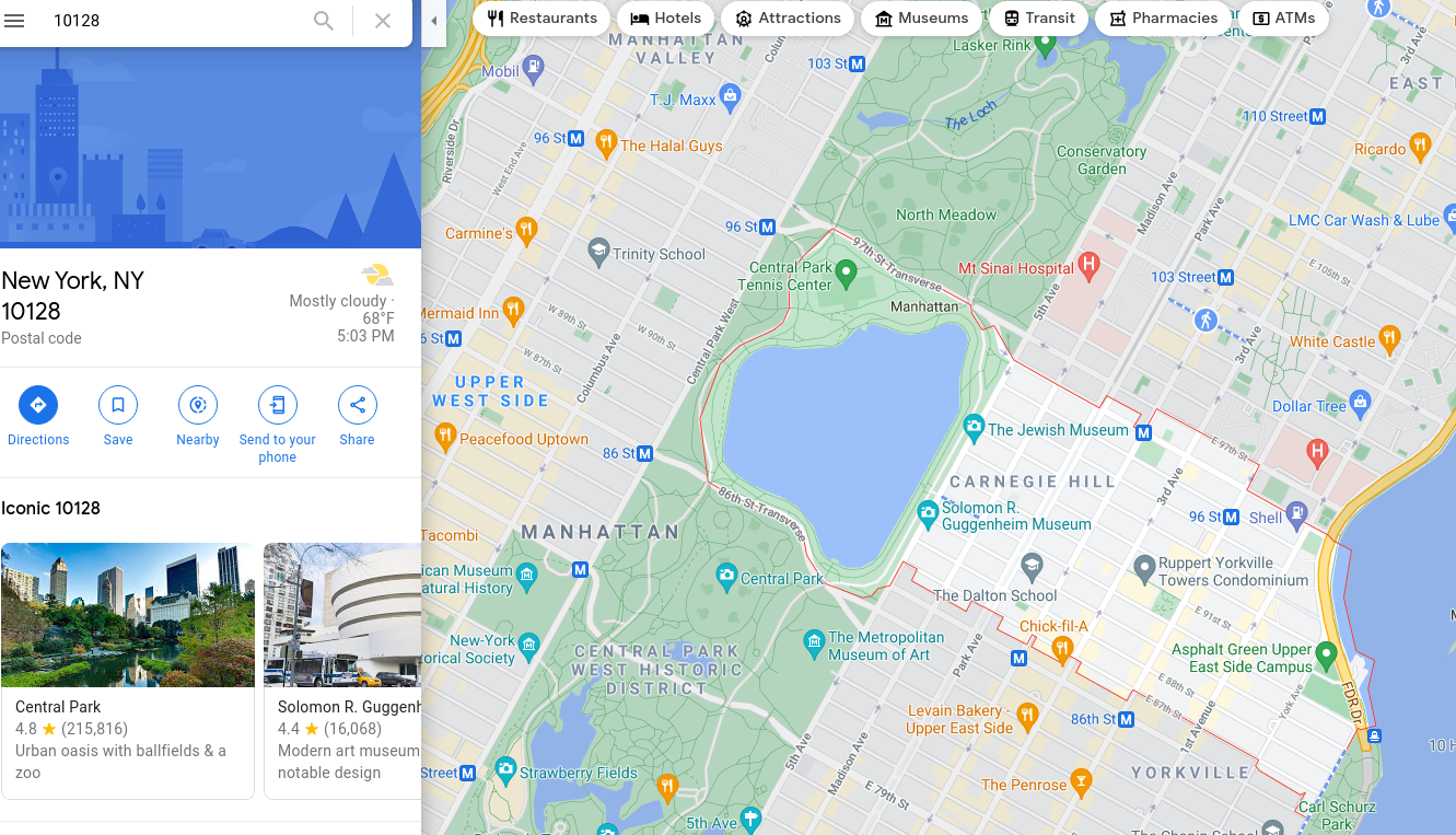
Are trees from Central Park being counted in the regions with highest tree per surface area?
Also, coincidentially, the areas that appear to be missing are central park, which is a host to more than 20,000 trees. It is then resonable to suspect that perhaps some of the trees being counted in these regions were accidentally counted from central park. Is is possible that this happened somehow? The best way to check that is to just look at the data.
Let's look at zip code 10128 which is one of these problem regions.
df_zc_10128 = df_trees[df_trees['zip_code'] == '10128']
df_zc_10128.loc[:, 'latitude'] = df_zc_10128['center'].apply(lambda c: shapely.wkt.loads(c).y)
df_zc_10128.loc[:, 'longitude'] = df_zc_10128['center'].apply(lambda c: shapely.wkt.loads(c).x)
import plotly.express as px
import os

# I am setting a mapbox token here to allow for street view
px.set_mapbox_access_token(os.environ['MAPBOX_TOKEN'])


fig = px.scatter_mapbox(
    df_zc_10128,
    lat="latitude",
    lon="longitude",
    zoom=13, center = {"lat": 40.78307, "lon": -73.95423},
    color_continuous_scale=px.colors.cyclical.IceFire, size_max=15)
#fig.show()
Again, I converted the figure to image to save space.
output_filename = 'images/2021_05_30_zip_code_10128.jpg'
with open(output_filename, 'wb') as file:
    file.write(fig.to_image(format='jpg', scale=4))
We get:
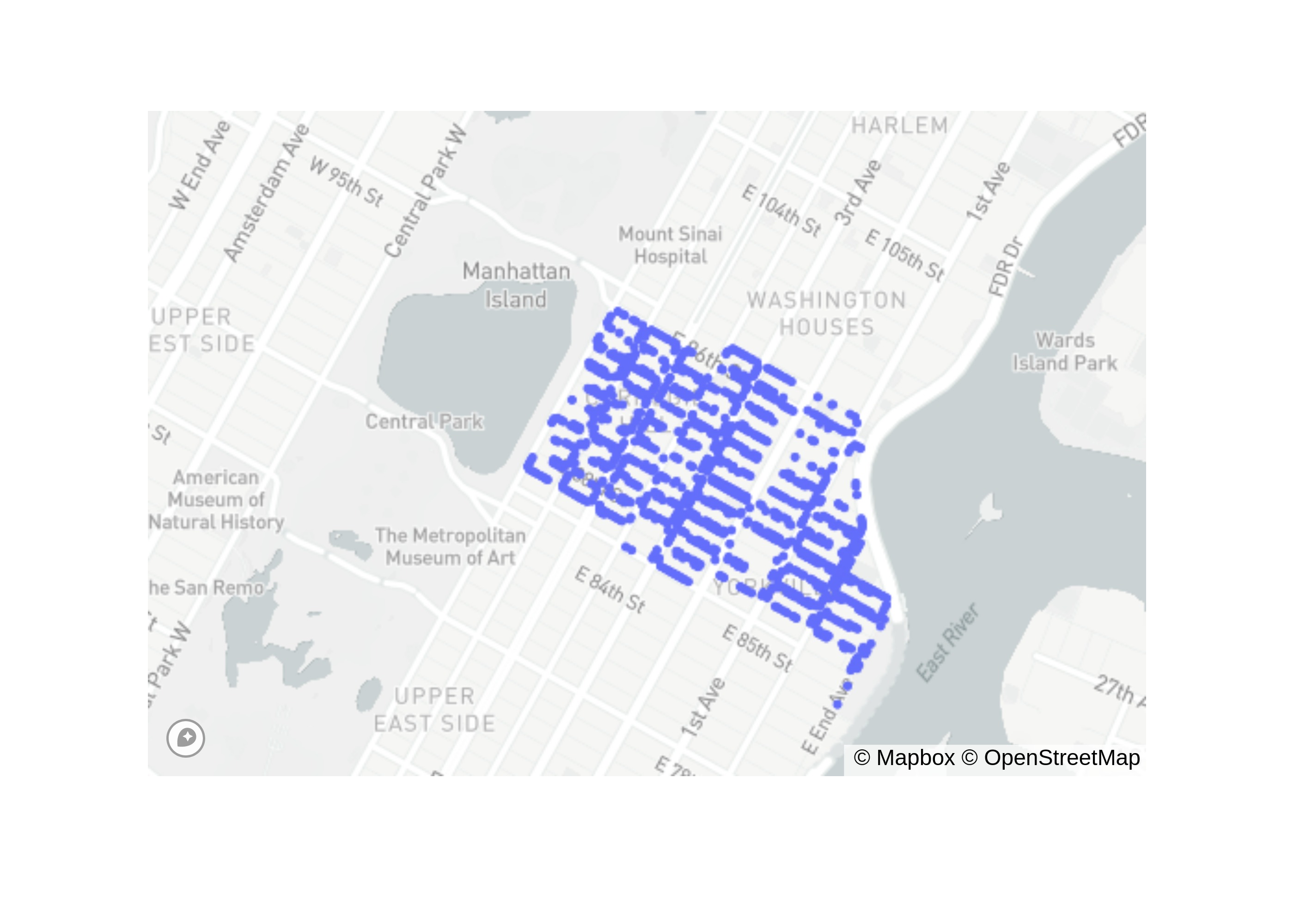
As you can see, the trees are legitimate!!!!
Conclusion
We reached the end. This blog post walked you through how to go from data to meaningful visualization for a sample data set in bigquery. In this case, we were curious to find regions that contained the most large trees, and thus were the most likely to be shaded. We found that the shadiest region is actually very close to Central Park (Upper East Side).
Next Steps
I hope this is motivating enough to start exploring the public datasets offered in bigquery. You can find them all here.
Also, for visualization, I demonstrated choropleth plots. It's also possible to visualize using tiling schemes. A very common one is the hextile, which tends to lead to nice looking visualizations. See here for more details. I hope to delve into it in more detail in a future post (but it is out of scope here for now).
I hope you enjoyed it!